GaleriYah
An avant-garde photography portfolio.
GaleriYah - Avant-Garde Photography Portfolio
Experience photography through a new lens with GaleriYah, where avant-garde design meets seamless functionality. This Next.js-powered platform transforms the way we showcase and interact with visual art.
Technology Symphony
Built with modern web technologies, GaleriYah orchestrates:
-
Next.js 13for lightning-fast performance -
Tailwind CSSfor stunning aesthetics -
Framer Motionfor fluid animations -
Supabasefor robust data management -
TypeScriptfor code reliability
Visual Experience
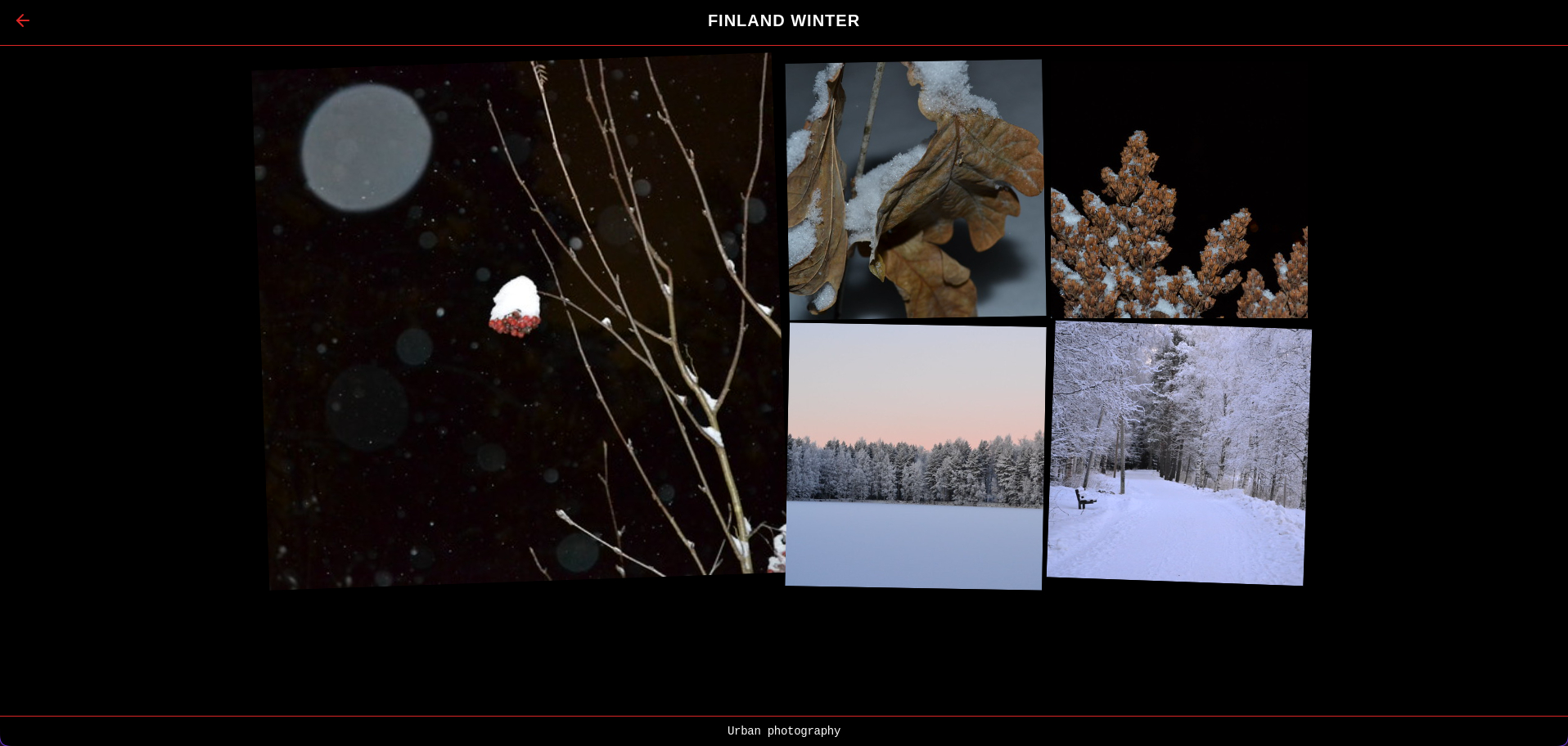
Dynamic Grid Layout
Explore the Grid

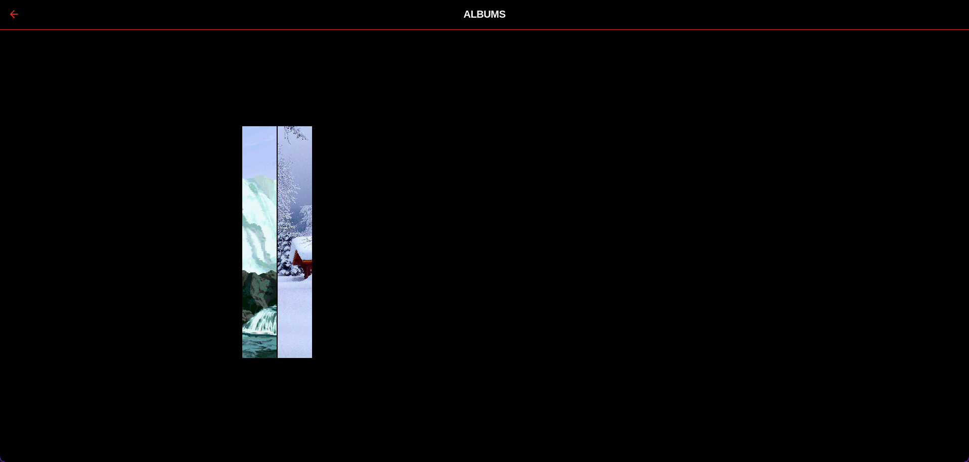
Album Viewer
Browse Albums

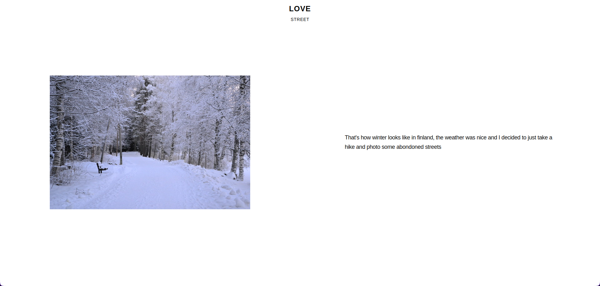
Photo Details
View Photo Details

Standout Features
Supreme-Inspired Navigation
One of GaleriYah’s most distinctive features is its Supreme-inspired navigation system. The minimalist design combines with bold typography and smooth transitions to create an experience that’s both functional and visually striking.
const MenuButton = () => (
  <button className="bg-white text-black font-bold text-xl py-2 px-4
    hover:bg-black hover:text-[#ED1C24] transition-colors duration-300">
    MENU
  </button>
);
Dynamic Photo Grid
The photo grid adapts to content, creating visual interest through varied sizes and positions:
const getPhotoClassName = (index) => {
  const patterns = {
    large: "col-span-2 row-span-2",
    tall: "col-span-1 row-span-2",
    wide: "col-span-2 row-span-1",
    normal: "col-span-1 row-span-1"
  };
  // Dynamic pattern selection based on index
  return patterns[getPattern(index)];
};
Technical Highlights
Smooth Scrolling Implementation
useEffect(() => {
  const container = scrollContainerRef.current;
  const handleWheel = (e) => {
    e.preventDefault();
    container.scrollLeft += e.deltaY;
  };
  container?.addEventListener("wheel", handleWheel, { passive: false });
  return () => container?.removeEventListener("wheel", handleWheel);
}, []);
Development Journey
Creating GaleriYah has been an exciting exploration of modern web technologies and design principles. The project challenged me to:
- Implement complex grid layouts with dynamic sizing
- Create smooth, performant animations
- Design an intuitive yet avant-garde user interface
- Integrate seamless data management with Supabase (that sucked :D)
- Optimize image loading and delivery
Future Enhancements
The purpose of this design is to make it the most minimalistic there is, so every enhancement should follow this principal, in other words, less is more!
For a deeper dive into the code and implementation: